Thursday, 23 October 2014

Key Institutions


With the huge recent explosion of the internet since around the year 2002 music video showcasing has been dominated by YouTube, Vevo YouTube music channel and the TV channels MTV, 4 Music and Viva. These are all Huge conglomerate companies or really high up subsidiary companies. They work to a profit. This means that they only showcase the music videos with the largest followers. This is to retain the largest viewer numbers possible. YouTube pay channels when they reach a certain number of subscribers and can also pay per view. this allows the large channels like VEVO with 7.76 million subscribers to make a lot of money. for some bands the music video is seen as just as important as the music itself and VEVO is the place where they can share their videos."The concept for Vevo is a Hulu for music videos, with the goal being to attract more high-end advertisers." They make their money from a merchandise store and links to places to buy the song being viewed.

MTV, 4 Music and Viva are the top 3 TV music stations. they show the top 40 singles in the charts at the time. They show the top 40 along with the accompanying video. millions of people tune in to see the top 40 and prefer to do so than listening to it on the radio because its more interesting due to them showing the video and not just the music itself.

All of these channels help to promote the musicians that they play exposing them to huge viewer numbers. They also allow viewers to feel like they are in a group (uses and gratifications of media). This allows them to feel part of a group giving them things to converse about. e.g. "did you see the new video for Coldplay on VEVO."

Labels:

Tuesday, 21 October 2014

Technical skills development

This Blog post is about work I have done in the media outside of school and how it relates to my media work in school.


These Two photos are from the Asylum Skate park Facebook and web page. I shot the second one with the intention for it to become the profile picture. Because of this I had to ensure that what I wanted to be in the photo was in the middle of the frame. This is because when you use a photo as a profile picture it crops it into a square. so anything that wasn't in that square wouldn't have shown up. I then emailed it to the skate park where they added the logo for the skate park in the middle of the photo. due to the photo being indoors I had to use two external flashes to lighten up the image and also isolate the riders and the ramps they were performing the tricks on. to do this I had to have an understanding of sync speeds of the flashes, power output of the flashes and the effect it has on the settings in camera like ISO, aperture and shutter speed. This will help me in my filming for a music video because it will allow me to get the precise look I want from the footage giving it meaning and a desired feel.


The photo below was a photograph I shot for the new up and coming football app High Five it. Shooting this photograph has helped me in my school media project a lot. This is because I had a real brief for the photograph. I had to include the whole team including two present chesterfield football players. it also had to show the newly awarded ,kit ,balls and cheque. It also improved my time management as I had to be at the specific location in time to set up and organise the photograph. After the shoot I had to quickly post process the image ensuring it was of a high quality. this is because it was going to be in the local newspaper the Derbyshire Times and also on the social media accounts for the app itself. This has made me realise the importance of being organised and punctual to a shoot. It will help me in the shoot as I will know how to direct the people to get the desired look. Also it will help me stick to the deadline given as I know how important it is now.


The photograph below was used by the multi national tyre company Maxxis.  I have linked below some facts about the company as it is in the top 10 tyre companies in the world.

Company Information

  • Founded in Taiwan in 1967
  • 23,500 employees worldwide
  • Operations in Taiwan, China, Thailand, Vietnam, the United States, Canada, Great Britain, Germany, Holland, Japan and Dubai
  • Product distribution in approximately 170 countries
  • Worldwide revenue of over $4 billion U.S. dollars
  • Worldwide revenue more than quadrupled in the past 10 years
  • Full lines of tyres for auto, bus, truck, light truck, bicycle, motorcycle, ATV, race kart, trailer, industrial and lawn & garden

Notable Facts

  • Original equipment supplier to Ford, GM, Toyota, Nissan, Volkswagen, Mitsubishi and Hyundai in Asia
  • Original equipment supplier of motorcycle tyres to Yamaha, Honda, Suzuki and Kawasaki
  • Original supplier of ATV tyres to Honda, Yamaha, Suzuki, Kawasaki, Polaris and KTM
  • Original equipment supplier of bicycle tyres to Cannondale, Giant, Merida, Yeti, Iron Horse, Kona and Orange
  • Original equipment supplier of scooter tyres to Yamaha, Suzuki, Aprilia, Malaguti, Piaggio, MBK, Gilera and Kymco

In the photo I used my camera knowledge to create the blurry yet sharp photo. I used a panning technique and a slow shutter speed (around 1/30th of a second) to ensure that relative to the camera the rider was relatively stationary. this then means that the rider is sharp and the background is blurry. this creates a sense of motion. I would like to use my camera knowledge to create different shots like this in my music video to portray the band in particular ways and also to make it interesting, eye catching and enjoyable to watch.


Below are two more photos that have recently been used reposted by the BMX magazine "Ride UK BMX"


Labels: ,

Monday, 20 October 2014

Media productions logo.

Here is the logo I have designed and will be using for my a2 media pieces. I have used the idea of an eye as the media that I generate is mostly visual. and inside the eye is a representation of an aperture. This is because aperture is a huge part in the filming/photography practices. It controls the look and feel of an image caused by the depth of field.it also controls the amount of light that falls on the sensor allowing to change the ISO and shutter speed all around what feel you want from the image. Due to the aperture being inside a human eye also points towards theories of that is the media controlling how we think or are we the audience controlling what is shown in the media. I have used a variety of programs to make the logo. to start with I downloaded what I thought would be the best aperture. I then saved the picture as a tiff this retains the best quality possible. I Then put the aperture photo into paint. I used paint to put on the outlines of the eyes using the bendy line tool. after this I then exported the file into adobe Photoshop cs6. This is where I added the text. I went through many fonts and sizes until I ended up with this. I also used the transform tool to make the text bend into the arches. this is to make it look like the pupil of the eye.

Labels: ,

Thursday, 9 October 2014

Top 5 music album covers.

1
Artist: The Beatles
Album: Abbey Road
Designer: Kosh/Iain MacMillan

This album is one of the most recognisable album covers of all time. it features the members of the beetles all walking in sync outside the abbey road studios. It is such a good cover due to its simplicity. the simplicity makes it easily recognisable and featuring the 4 members of the band also makes people want to buy the album because fans idolise these people and model themselves what clothes they wear.


2
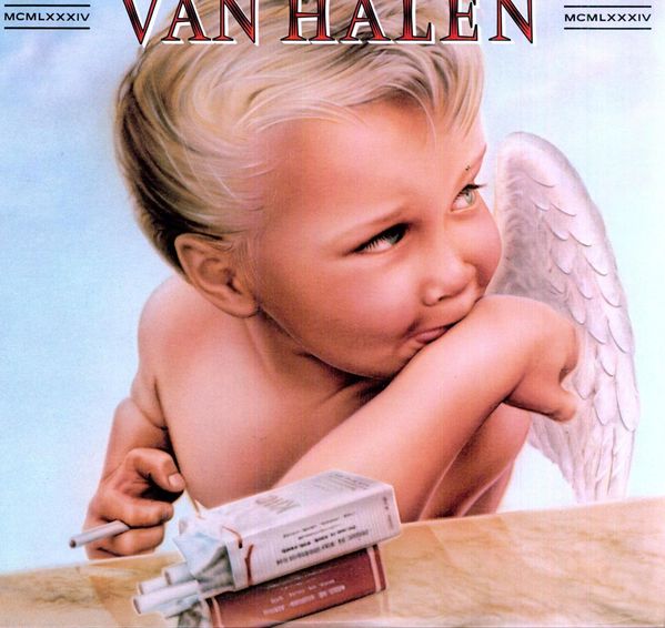
Artist: Van Halen
Album: 1984
Designer: Pete Angelus, Richard Seireeni, David Jellison, Margo Zafer Nahas

this album created for Van Halen in 1984 was quite controversial. This is because it uses a young blonde boy angel looking all sweet but he has two packets of cigarettes and is smoking one. this is a sign of rebellion and satanic which can usually be a recurring theme in the rock genre. there is also a dreany crayon effect been used by the artist when he drew the artwork to make a point that " Rock 'n' roll can corrupt anyone or anything. The Devil's got the best tunes."

3
Artist: AC/DC
Album: Back in Black
Designer: Bob Defrin

This album was the first album that the band released after the first lead singer Bon Scott died and it was completely black. the only thing it had on the cover was the name of the band and the name of the album BACK IN BLACK. this was done as a tribute to the lead singer. it was also a selling point as the album meant things for the fans.

4
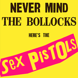
Artist: The Sex Pistols
Album: Never Mind The Bollocks
Designer: Jamie Reed

this album Jamie Reed the designer wanted to get across the DIY feel of the punk genre. he made it look like it had been cut and stuck with random parts of newspapers as world on goings is a fuel for the songs and lyrics in the punk genre. also the bright luminous pink and yellows were used as a selling point as it was their first album so they didn't have a fan base. So using the bright colours made it stand out on the shelves making people want to buy it.

5
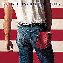
Artist: Bruce Springsteen
Album: Born in the USA
Photographer: Annie Leibovitz

This album cover poses a stereotypical American teenager With his jeans , baseball cap, white short sleeve t-shirt and belt. the man stands in front of the American flag. This is a use of inter-textual visual links. as The album is called "Born in the USA" Is
all about teenagers growing up and having fun in the USA.


Labels:

Thursday, 2 October 2014

Letter to media Executive


Dear Mr Welch
I am writing to you to explain my idea for a new music video I am involved with.
The idea is to make a music video for my friend’s band called “YOUF” they are a 5 piece emo/punk band from Mansfield. The song I will be making the music video for is “sick and tired.” The idea is to get a lot of footage from local gigs as that is a huge part of these genres influences and can be seen regularly in other bands music videos in this genre. Another huge influence to this genre is skateboarding. Most of the band members all skate so regularly go out skating even in-between sets at gigs so I will be incorporating this into the video as well. There are also sections from a recording session that the band had at the clearway music studios in Liverpool that I attended and filmed. This mixed in with the live music and some extra footage I will separately be shooting will allow for a large variety of shots and venues. It will also allow me to do lip syncing from the proper recording and the footage from the live gigs.
This music video will be targeted towards the punk emo genres due so I will use certain shots of the live shows like singing into the crowd and also the clothes that the band members wear as in the punk/emo genre clothing style is a huge part of the image of the band so making sure the right clothes are worn will be something I will be watching closely to ensure it is correct. The footage will also be slightly under exposed and under saturated and even with some black and white clips in this is to stay within the conventions of the emo/punk genres due to the deep and dark meanings behind some of the lyrics to the songs.


Labels: