Top 5 music album covers.
1
Artist: The Beatles
Album: Abbey Road
Designer: Kosh/Iain MacMillan
This album is one of the most recognisable album covers of all time. it features the members of the beetles all walking in sync outside the abbey road studios. It is such a good cover due to its simplicity. the simplicity makes it easily recognisable and featuring the 4 members of the band also makes people want to buy the album because fans idolise these people and model themselves what clothes they wear.

2
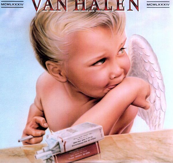
Artist: Van Halen
Album: 1984
Designer: Pete Angelus, Richard Seireeni, David Jellison, Margo Zafer Nahas
this album created for Van Halen in 1984 was quite controversial. This is because it uses a young blonde boy angel looking all sweet but he has two packets of cigarettes and is smoking one. this is a sign of rebellion and satanic which can usually be a recurring theme in the rock genre. there is also a dreany crayon effect been used by the artist when he drew the artwork to make a point that " Rock 'n' roll can corrupt anyone or anything. The Devil's got the best tunes."

3
Artist: AC/DC
Album: Back in Black
Designer: Bob Defrin
This album was the first album that the band released after the first lead singer Bon Scott died and it was completely black. the only thing it had on the cover was the name of the band and the name of the album BACK IN BLACK. this was done as a tribute to the lead singer. it was also a selling point as the album meant things for the fans.

4
Artist: The Sex Pistols
Album: Never Mind The Bollocks
Designer: Jamie Reed
this album Jamie Reed the designer wanted to get across the DIY feel of the punk genre. he made it look like it had been cut and stuck with random parts of newspapers as world on goings is a fuel for the songs and lyrics in the punk genre. also the bright luminous pink and yellows were used as a selling point as it was their first album so they didn't have a fan base. So using the bright colours made it stand out on the shelves making people want to buy it.

5
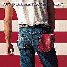
Artist: Bruce Springsteen
Album: Born in the USA
Photographer: Annie Leibovitz
This album cover poses a stereotypical American teenager With his jeans , baseball cap, white short sleeve t-shirt and belt. the man stands in front of the American flag. This is a use of inter-textual visual links. as The album is called "Born in the USA" Is
all about teenagers growing up and having fun in the USA.

Labels: Research and Planning

0 Comments:
Post a Comment
Subscribe to Post Comments [Atom]
<< Home